Background
In the spring of 2021, I participated in a ZFA (Central Vocational Training Committee Print and Media) cover contest for the Print and Media Abc. This is a magazine for trainees and students who deal with the topic of printing and media. The only requirements were a few words and the size of the cover picture.
Outcome
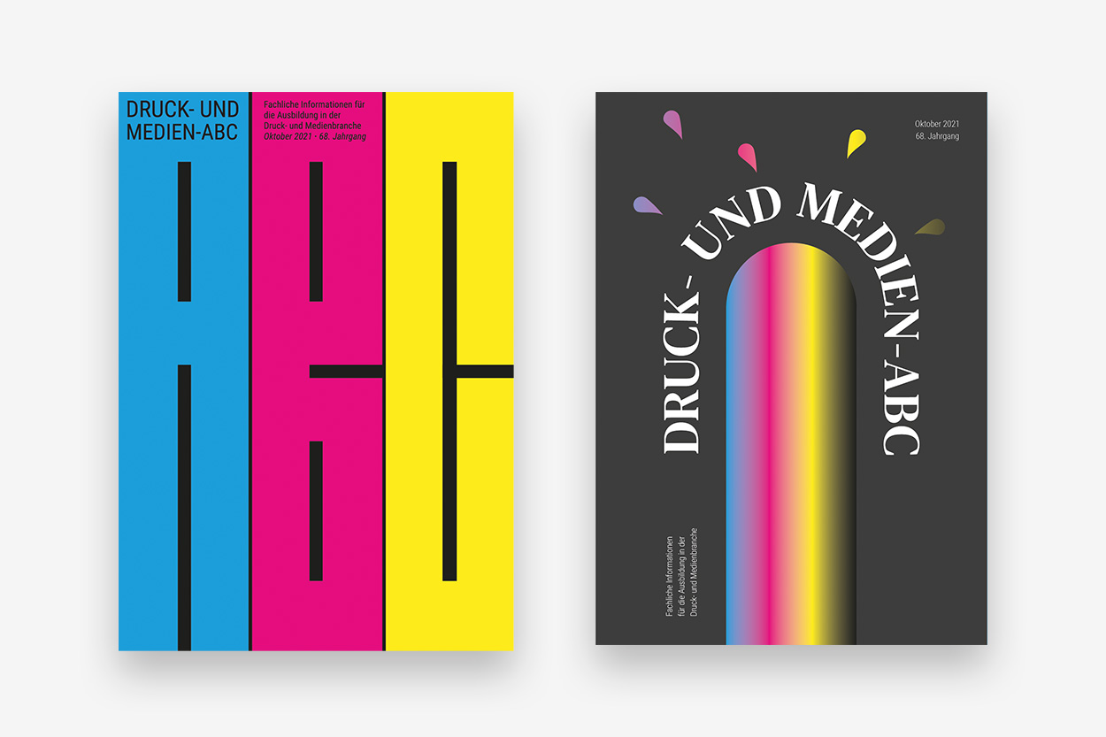
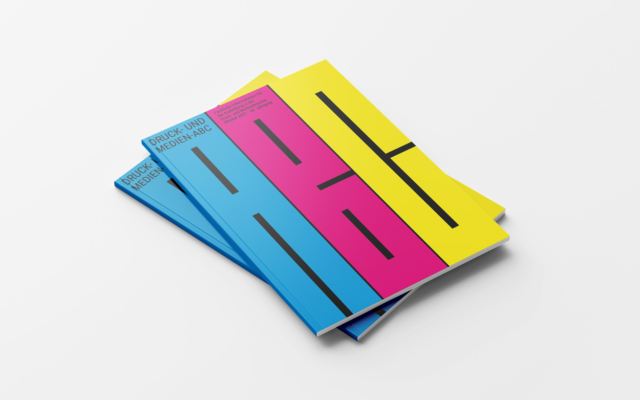
So I thought about it and immediately came up with the idea of using the four printing colors cyan, magenta, yellow and black unchanged. I incorporated the whole thing into both designs. The first cover shows the letters ABC, which also appear in the title. They are colored in cyan, magenta and yellow and are separated from black. Because the letters are so long it is difficult to decipher them at first, but after reading the title it becomes clear.
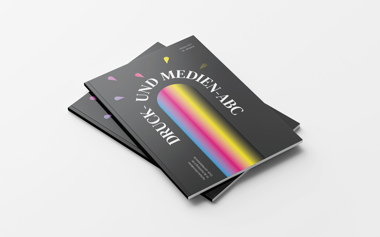
The second design also works with colors again, this time in the form of a gradient.The gradient represents a waterfall of colors, the drops make this clear.The gradient represents a waterfall of colors, the drops make this clear. The title is curved in this design, separating the waterfall from the top of the page and looking like the gout of the waterfall. The background is dark gray so you can still see the black in the gradient

Letter cover
Gradient cover