Background
After I started drinking single malt whiskys in 2019, I slowly got a feel for the many different flavors. Looking for new flavors, even in other spirits, I got the idea to create my own liqueurs with interesting flavors. At the same time I wanted to create a fictitious liquer brand and design a logo, bottles, and a website for it.
Outcome
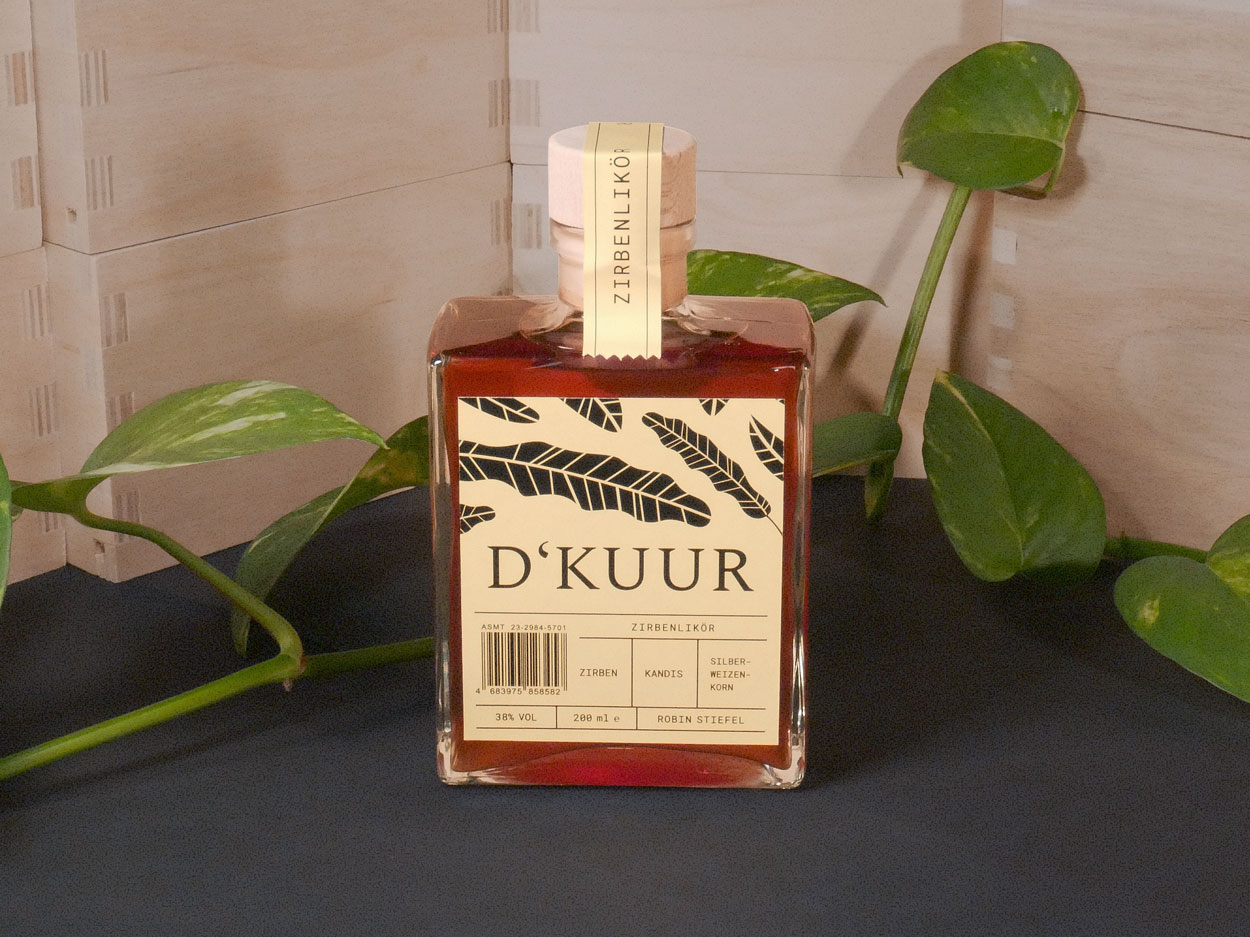
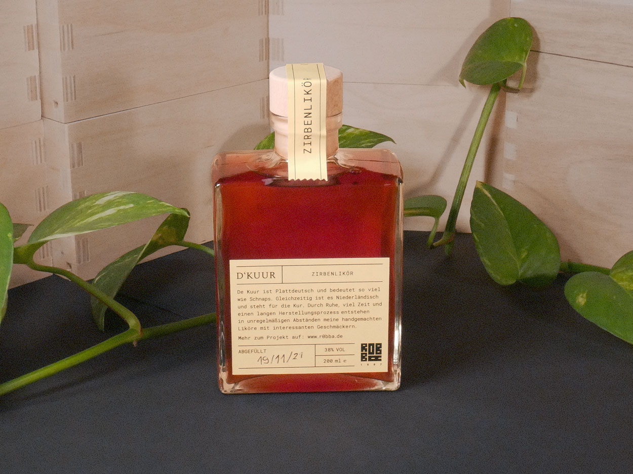
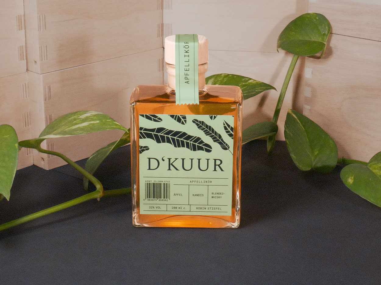
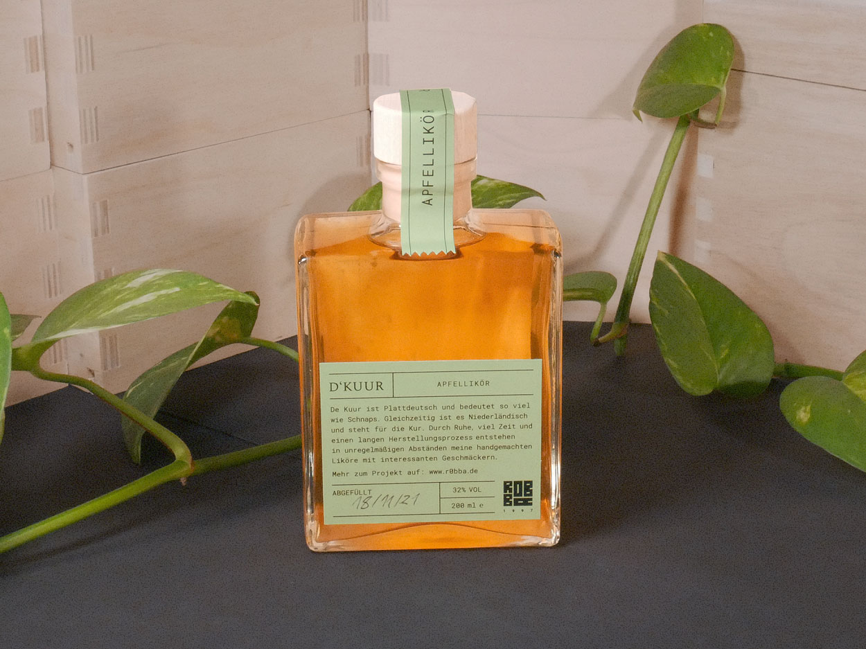
The result is a brand with the name D'KUUR. This name contains two meanings, once the cure from Dutch and alcohol from the Low German of my area. The font is Spectral with Roboto Mono. The liqueurs are distinguished by their differently colored labels. They all contain abstract graphics of leaves, which represent the sustainable ingredients. The website design is still in the process of being created.

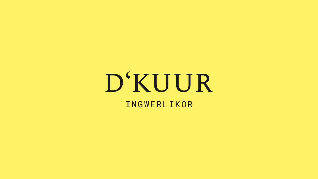
Inwerlikör is coming in Summer 2022